


I'd now like to take this further and do a series of "SQL Developer 1.1: How Do I ....", first using the evaluation drops as they become available and continue that into the production release.
In showing how to go about discovering new things and working with 1.1 in general, I could take 2 quite different approaches. The one approach would be to be quite organized and plan a whole schedule of entries and the other is to write random ad hoc entries that just jump in and out of the tool all over the place. I'm opting for the latter approach, because right now I am inspired to do a quite write up, just covering a basic chart in SQL Developer 1.1
Building a Chart using SQL Developer 1.1
At this stage I should point out, that the only 1.1 software you have access to is SQL Developer 1.1 Evaluation Release 1.1.0.21.41. That's what I am going to use. If you do not yet have that release, then go to OTN and follow the links to download it.Assumptions:
The query I will use in my example is for the user SCOTT/TIGER and requires that you have access to SCOTT's EMP and DEPT tables and a Connection to SCOTT.
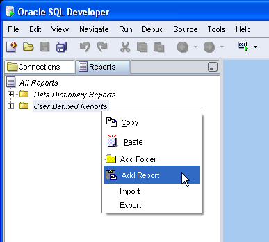
Starting with the Reports Tab, select User Defined Reports and, using the context menu, select Add Report. If you're diligent, you could add a folder first, so that all your reports are saved into carefully planned categories.
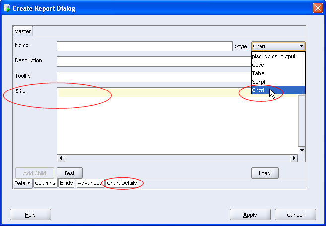
 Once you have invoked the new report dialog, there are three areas you should take special note of:
- The Style of report, in this case a CHART
- The SQL text
- Chart Details
 It is obviously important to complete other details, such as name and tooltip, these I'll leave you to do. I want to create a chart of Employees' Salaries per Department. Here's my query. Note, no trailing ';'
select emp.deptno, emp.ename, sal
from emp, dept
where emp.deptno = dept.deptno
order by dept.deptno, sal
When creating a chart, the rule of thumb is select group, series, data from table
Before you test the chart, select the Chart Details and change the chart type to BAR_VERT_STACK. For the rest of the options, you can make your own choices. For bigger reports, the Legend can take up quite a bit of real estate, so I tend to set that to False. You can see what suits you. Once you have set the Chart Details, you can return to the Details tab and Test the chart or just select Apply.
Once back in the Navigator, select your report and select the connection you have for SCOTT.
 The stripy pajama report reflects the 4 departments in the table , with each employee and salary. The mouseover for each node indicates Employee name and Salary. The power of the chart is that a glance you can see that, based on my data, Department 20 has the greatest salary bill, while Department 10 appears to have the highest paid employee.
This is a trivial example, but you'll note that the results returned are quite rich. Why not try this against some of your System data?
2 comments:
that was certainly an incentive to start looking at sql developer - having used Toad for so long , I sometimes think it is going to be hard for us to change habits.
See OTN Forum on how to create Pie Chart:
http://forums.oracle.com/forums/thread.jspa?messageID=3239063
Post a Comment